BATESVILLE, Ark. — The athletics department at Lyon College opened a new chapter as it unveiled a new logo for the Scots Monday during a press conference.
“We’ve developed a stronger athletic brand that will allow us to better market ourselves to prospective students,” said Kevin Jenkins, Director of Athletics at Lyon.

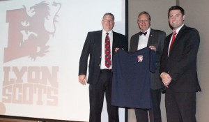
Lyon College Director of Athletics Kevin Jenkins (left), President Dr. Donald Weatherman (center) and Joshua Tate, Director of Marketing and Communications, enveiled the new Scots Athletics logo during a press conference Monday in the Maxfield Room of the Edwards Commons. (Photo by John Krueger)
With new additions to the athletic program such as football and men and women’s wrestling, Jenkins said the time was ripe for creating a strong athletic identity for the Scots.
The new logo features the rampant lion from the college’s seal, a symbol that embraces Lyon’s Scottish heritage. Joshua Tate, Director of Marketing and Communications, created the new logo, along with a custom word mark and style guide for usage of the new athletic brand.
“It was clear that the Lyon Scots needed a new visual identity that not only would represent who they are, but also create a traditional yet current brand that fell more in line with the history of the college. Using the rampant lion that is part of the college seal seemed a great opportunity to play to our Scottish heritage, while creating a strong symbol that is uniquely Lyon,” Tate said.
Lyon President Dr. Donald Weatherman said the changes in the Athletics department were part of a grander process designed to promote growth at Lyon. The College recently approved the construction of two new residence halls to accommodate Lyon’s rapidly growing student body.
“This [logo] will be something unique to us. It will give us an identity that we lacked, and is part of the process of clarifying who we are,” Weatherman said.
Jenkins presented Weatherman with the first polo shirt with the school’s new logo at the press conference.
The design received positive feedback from those in attendance. Dr. Bruce Johnston, Vice President for Student Life and dean of students, said he loved the new logo.
“I’m trying to not just say, ‘Wow!’ I think it’s great. I love the look. I love the lettering,” he said.
Tracy Stewart-Lange, women’s head basketball coach, said she was resistant to change but thought the new look would give the Scots a strong, unified look.
“I’m not a real change person. I struggled to let go of the Pipers, because I was a Piper. But I really do like the new logo. It’s very clean and very strong. My favorite part is the font. I think it’ll be great that we have one cohesive look,” she said.
The new logo replaces the image of Scottish warrior brandishing a claymore sword and carrying bagpipes on his back that was designed in 2009. Those in attendance at the press conference received T-shirts featuring the new logo.


